
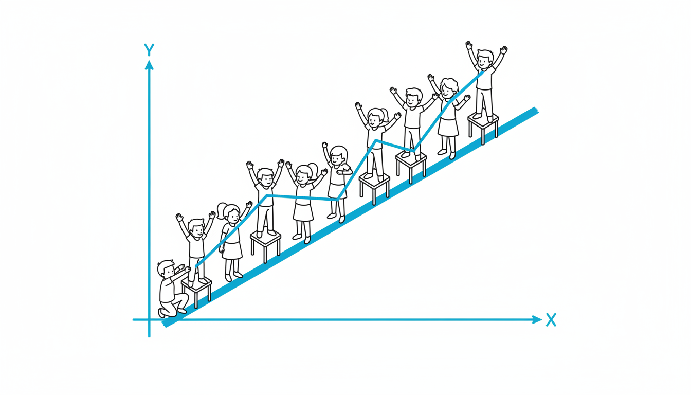
Living Graph
At a Glance
- Time: 3-4 minutes
- Prep: Minimal (data points or values written on cards)
- Group: Whole class or groups of 6-15
- Setting: Any space with floor area to arrange students in formation
- Subjects: Math, Science, Social Studies - any subject using data
- Energy: Medium
Purpose
Transform abstract data and graphs into tangible physical experience by having students use their bodies to form line graphs, bar charts, or scatter plots, creating kinesthetic understanding of trends, patterns, and data relationships that are difficult to grasp from 2D representations alone.
How It Works
- Establish axes (30 sec) - Define floor space as coordinate plane; identify x-axis and y-axis locations using tape or verbal designation
- Assign data points (30 sec) - Give each student (or small groups) a card with specific data point values (x-coordinate and y-coordinate)
- Students arrange themselves (90 sec) - Students move to their correct position based on their coordinates, standing at the height/position that represents their y-value
- Form the graph (30 sec) - Students hold arms to connect and create the line or bar visual; class observes the shape
- Analyze pattern (30 sec) - "Look at our graph. What trend do you see? Where's the highest point? When did the rate of change increase?"
What to Say
Opening: "We're going to become a living graph! This wall is the y-axis showing [temperature/population/scores]. This line on the floor is the x-axis showing [time/months/trials]. Each of you has a data point. Find your position and stand at the correct height."
During: "Check with neighbors - are you in the right order on the x-axis? Should you be higher or lower than the person next to you?"
When formed: "Hold hands or link arms to create the line. Perfect! Now look at our graph from the side. What do you notice about this shape?"
Closing: "You just created a visual representation with your bodies. When you see this graph on paper, remember standing in it. What did the curve feel like?"
Why It Works
Embodied learning research demonstrates that physically experiencing mathematical and scientific concepts creates stronger neural pathways than passive observation (Abrahamson & Lindgren, 2014). When students become data points, they must reason spatially about relative values, slopes, and trends in ways that engage proprioceptive and vestibular systems alongside cognitive processes. The social negotiation of "Am I higher than you?" reinforces comparison and estimation skills while making abstract data concrete.
Research Citation: Embodied cognition in mathematics learning (Abrahamson, 2014)
Teacher Tip
Start with simple line graphs before attempting scatter plots or 3D representations. Use familiar data students care about (class test scores over time, temperature throughout the day, height of students by age) rather than abstract data sets. The more personally meaningful the data, the more engaged students become in accurately representing it with their bodies.
Variations
For Different Subjects
- Math: Graph quadratic functions, exponential growth, linear relationships; students embody the equation
- Science: Temperature change over time, population growth, chemical reaction rates, speed-distance-time relationships
- Social Studies: Historical population data, economic trends, election results over time, immigration patterns
For Different Settings
- Large Class (30+): Each student is one data point; creates very detailed graph; or divide into groups creating multiple small graphs
- Small Group (5-10): Fewer data points (one per student); focus on dramatic changes in slope; or students hold multiple positions sequentially
For Different Ages
- Elementary (K-5): Simple bar graphs with whole-class data (number of siblings, favorite colors); students stand in rows by category
- Middle School (6-8): Line graphs with clear trends; introduce coordinate plane explicitly; students calculate their own positions
- High School/College: Complex functions, multiple variables, correlation vs. causation; add second group to show comparative data sets
Online Adaptation
Tools Needed: Virtual graphing tool (Desmos, GeoGebra, Google Sheets) + video platform
Setup: Shared digital graphing space visible to all
Instructions:
- Assign each student a data point coordinate
- Students add their point to the shared digital graph one by one
- Use annotation tools to connect points and form line
- Alternative: Create human graphs in breakout rooms with small groups; each group creates their segment
- Screenshot final graph and discuss trends in main room
Pro Tip: Use virtual backgrounds where students hold up signs with their y-value coordinates visible; arrange in gallery view to see the "living graph" of faces.
Troubleshooting
Challenge: Students don't understand coordinate plane or can't find their position Solution: Start simpler - create one-dimensional representation first (bar graph) before adding x-y coordinates. Or assign "helpers" who have mastered coordinates to assist others.
Challenge: Graph is crooked or students are unevenly spaced Solution: Designate "axis markers" - students who stand at key intervals (0, 5, 10, 15 on y-axis; 1, 2, 3, 4 on x-axis) to serve as reference points.
Challenge: Class size doesn't match number of data points needed Solution: Have some students represent multiple points (step forward for one value, step back and reposit for another) or combine students (pairs hold one data point together).
Extension Ideas
- Deepen: Add a second data set using different students creating a comparative graph side-by-side; discuss differences
- Connect: After forming graph, have students predict what happens next: "If we add one more data point for next month, where would that student stand?"
- Follow-up: Students sketch the graph they formed from memory, then add calculations (slope between two points, area under curve, etc.)
Related Activities: Human Periodic Table, Human Spectrum, Four Corners