
Graph Without Axes — The Naked Graph
The same data tells completely different stories depending on labels:
At a Glance
- Time: 3-4 minutes
- Prep: Minimal (whiteboard drawing or slide with an unlabeled graph)
- Group: Whole class (prediction + progressive reveal)
- Setting: In-person, hybrid, or online
- Subjects: Universal (especially effective for science, economics, media literacy, policy)
- Energy: Medium
Purpose
Demonstrate that data visualization is not neutral — a graph is an argument, not a mirror of reality. A simple rising line with no labels is just a shape. But the moment you add axis labels, the same shape becomes hopeful news or terrifying news, depending entirely on what you label. This is The X Activity applied to data: same visual, different context, completely different meaning.
How It Works
Step-by-step instructions:
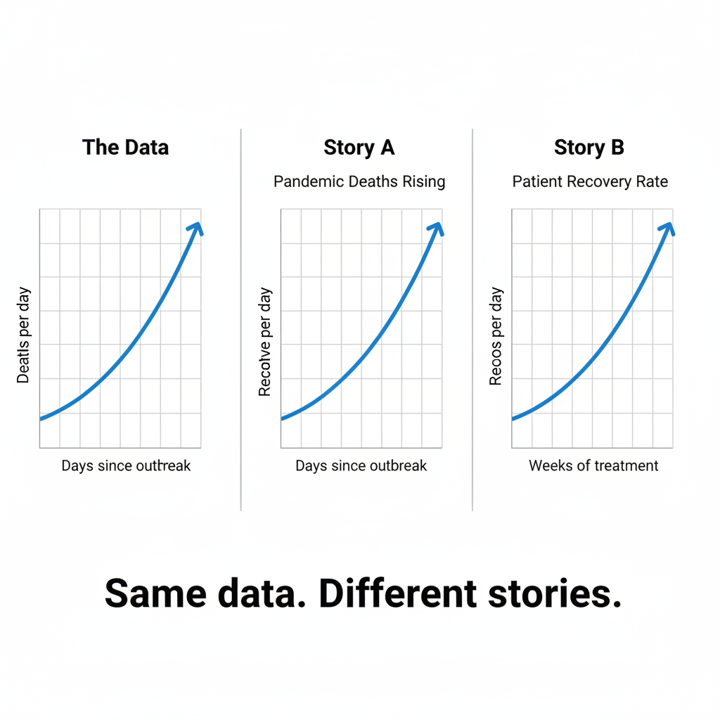
- DRAW THE LINE (10 seconds) — Draw a simple line graph: a line going steadily upward from left to right. No numbers, no labels, no title. Just a rising line.
- ASK (20 seconds) — "What does this show? Is this good news or bad news?" Collect answers: company revenue growing, population rising, temperature increasing, grades improving, stock price going up. Most will assume it's positive.
- LABEL 1 — ALARMING (15 seconds) — Label the Y-axis: Deaths. Suddenly the rising line is terrifying. "Is this still good news?"
- RELABEL — HOPEFUL (15 seconds) — Change the Y-axis to: Recoveries. The same rising line is now hopeful.
- CHANGE X-AXIS (15 seconds) — Label the X-axis: Days after treatment. Now it's a medical trial. Relabel to: Days after policy change. Now it's political data. The line never changed.
- THE LESSON (30 seconds) — "The line never moved. Not one pixel. But I made you feel alarm, then hope, then medical interest, then political opinion — all with the same data shape. Every graph you've ever seen made the same choices about what to put on each axis, what to title it, and what to leave out. Those choices are not neutral. They are arguments."
What to Say
Opening: (Draw the rising line.) "Quick — is this good news or bad news?"
After "Deaths": "Still good news? (Pause.) The same line you were smiling at 10 seconds ago is now a crisis."
After "Recoveries": "And now it's hope again. Same line. Same slope. Completely different emotion."
Closing: "This is the most important data literacy lesson: a graph is not a fact. It is a FRAME. The person who chooses the axes, the scale, the title, and the time range is the person who controls the story. That person might be a journalist, a politician, a researcher, or an AI. Your job is to ask: what would this graph look like with different labels?"
AI connection: "When AI generates charts or presents statistics, it makes framing choices — which variable on which axis, what scale, what comparison. Those choices shape your conclusion as powerfully as the data itself. Always ask: what story would the OPPOSITE labeling tell?"
Why It Works
Nobel laureate Daniel Kahneman's research on the framing effect demonstrated that humans respond very differently to "a treatment with a 90% survival rate" versus "a treatment with a 10% mortality rate" — even though these are mathematically identical. The graph exercise makes this viscerally tangible.
This is also a demonstration of what Edward Tufte calls the "lie factor" in data visualization: the ratio between the effect shown in the graphic and the effect in the data. By stripping away all labels, the exercise reveals that the "shape" of data is meaningless without its frame.
Research basis: Kahneman, D. & Tversky, A. (1984). Choices, values, and frames. American Psychologist. | Tufte, E. (1983). The Visual Display of Quantitative Information.
Teacher Tip
Use the same line for all reveals — don't redraw. The point is that the visual shape never changes. If you draw a new line each time, the lesson weakens. Keep pointing to the same line and just changing the labels. The visual constancy while the emotional reaction swings wildly IS the lesson.
Variations
For Different Subjects
- Science: Strip the labels from a real experimental graph. "What story does this tell? Is the treatment working?" Then reveal: the Y-axis is "tumor size" (rising = bad) or "immune response" (rising = good).
- Economics: Show an unlabeled line going down. "Bad news?" Label it "unemployment" — now it's great news. Relabel it "GDP" — now it's a recession.
- Media Literacy: Show actual news graphs with labels removed. Have students guess the story, then reveal the original. Compare how framing changed interpretation.
- History: Show population curves without labels. "Growth or decline?" Then reveal: growth of an empire vs. growth of a pandemic.
For Different Settings
- Large Audience (50+): Draw large on a whiteboard or use animated slides that add labels one at a time.
- Small Class (5-15): Give each pair a printout of the same unlabeled graph. Ask them to write their OWN axis labels to tell a positive story and a negative story with the same line.
- Workshop/PD: Show a real data visualization from the organization's reports with labels removed. "What story does this shape tell?" Then reveal the actual labels and discuss framing choices made by the report's author.
For Different Ages
- Elementary (K-5): Draw a line going up. "Is this the temperature getting hotter, your reading level getting better, or the price of candy going up?" Simple but effective.
- College/Adult: Use real-world datasets. Challenge them to find two valid but contradictory narratives from the same data shape.
Online Adaptation
Share a slide with an unlabeled graph. "Type in chat: what does this show? Good news or bad news?" Then animate labels appearing one at a time. The chat reactions shift with each reveal.
Troubleshooting
Challenge: Someone says "You can't interpret a graph without labels" immediately. Solution: "Exactly right. And yet — how many times have you looked at a graph in a presentation or news article and felt an emotional reaction before reading the labels? Your brain reads the shape first and the context second. That emotional first impression persists even after you read the labels."
Extension Ideas
- Deepen: Give students the same dataset and ask different groups to create graphs that tell different stories: one alarming, one reassuring, one neutral. Compare. "Same data. Three graphs. Three stories. Which one is 'true'?"
- Connect: Pair with Number Without Context (013) — one strips context from a single number, the other strips it from a data trend. Together they form a complete data-literacy module.
Related Activities: The Number Without Context, The X Activity, Sound of Silence